From brainstorming to drawings, how Amy's kitchen took shape.
Back in the summer of 2019 I began working with Amy and her husband Jeff to design their new Kitchen for their forever home that was being built. The builder already had a Kitchen layout for the home, but let's be honest.. they were seeking a "forever" kitchen with a wow factor. A space that could evolve as they evolved. One that had a timeless design, ample storage, and was high in function and feel. They wanted the design to maximize workspace and storage options, while still maintaining a sense of openness and light.
The initial concept came together rather quickly, and as I provided detailed drawings and elevations, Amy and Jeff had a clear vision of how the kitchen would look once completed. With each line and measurement, Amy and Jeff could envision themselves cooking and entertaining in the space. It was an exciting realization that the design was starting to come to life.
In order to achieve this we nixed the idea of the builder's corner pantry. While it seems like a practical choice, it would have taken away from the overall aesthetics of the kitchen. Instead, we opted for sleek, tall storage solutions that seamlessly integrated into the design, and re-located a walk-in pantry off the kitchen.
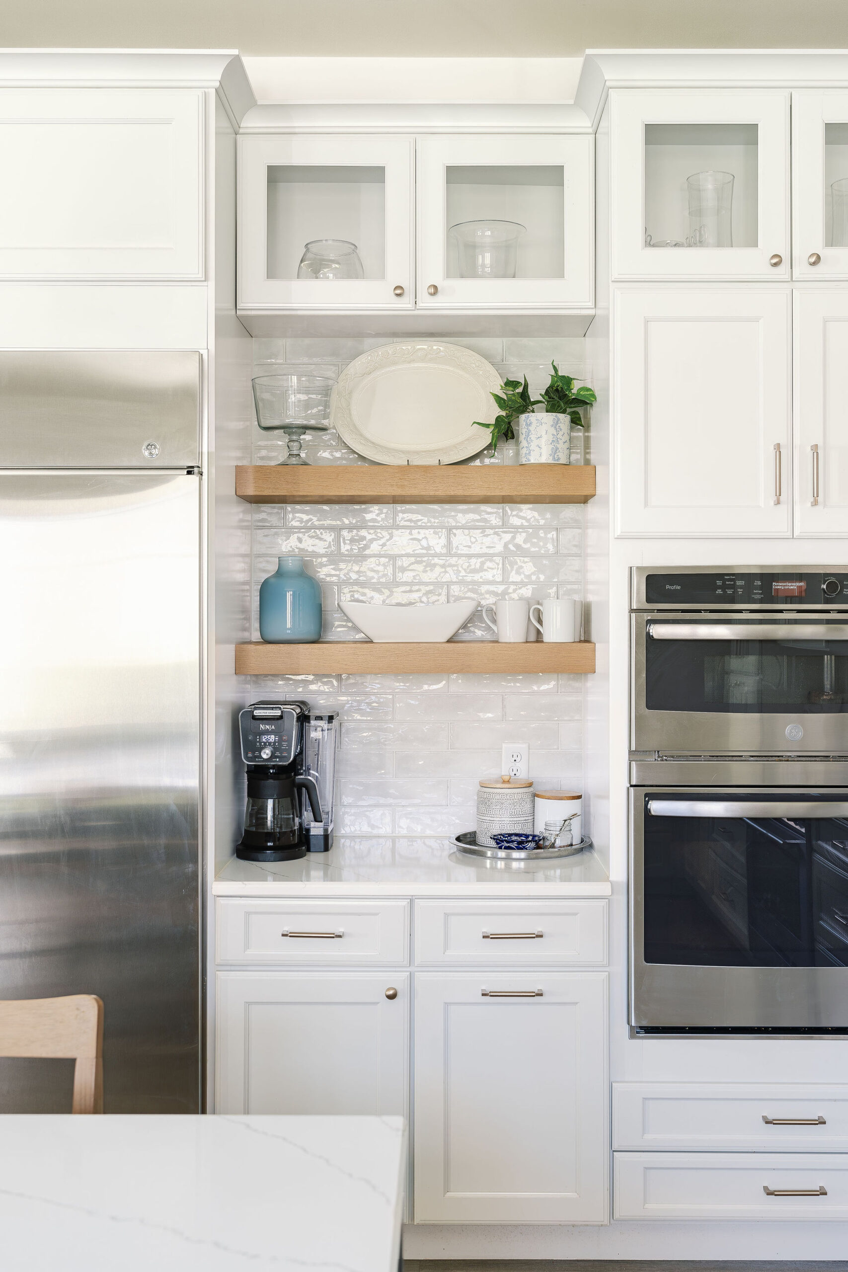
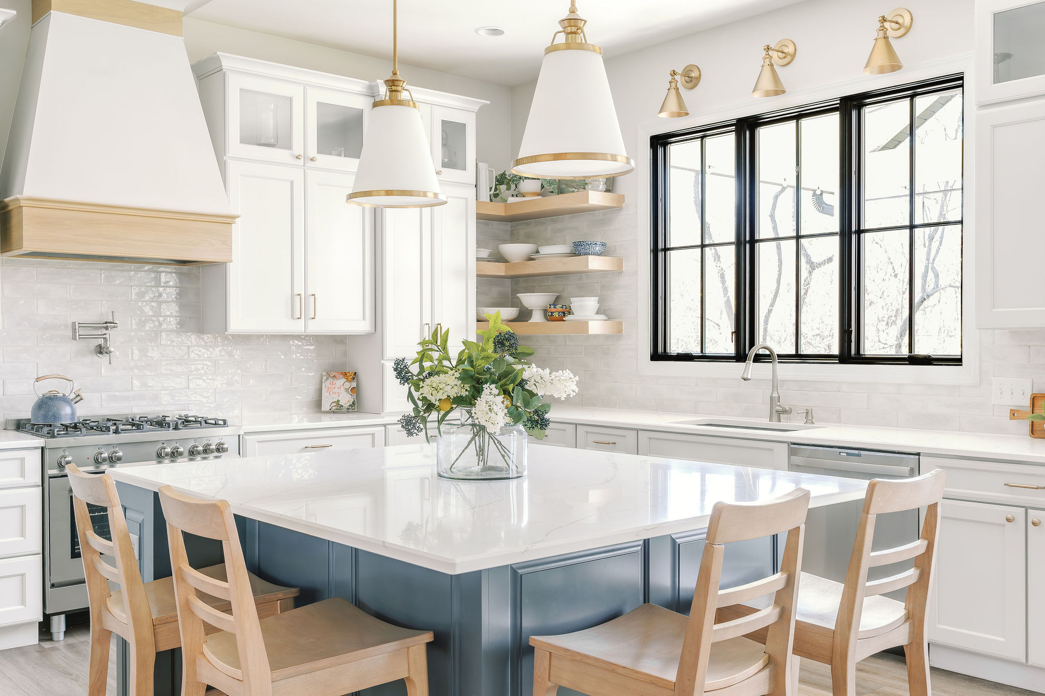 In addition to getting rid of the corner pantry, we added square footage to the builders existing kitchen layout, making it 4' deeper and 2' wider. This allowed us the room we needed to create a beautiful focal point along the back wall with a 36" range, custom hood, and ample storage and counter space. The expansion also allowed for space to incorporate a 48" wide fridge and built-in coffee nook. It also also provided the space we need to center a large set of wood casement windows along the sink wall which floods the space with natural light and clear sightlines to the back yard. With young kids running around, this was important!
 Some of the additional key details in terms of function included:
 The little details that make all the difference:
Designing Amy's Kitchen wasn't just about creating a functional and attractive space. It was about infusing every detail with love and personal touches. Amy wanted a kitchen that would not only meet their family needs but also reflect their personality and style.
One of the first things they considered was the color palette. Amy wanted the kitchen to have a fresh feel but not cold. The perimeter cabinets are actually a soft greyish white. Sometimes they look white and other times they look more warm and grey, depending on the time of day. They opted for a deep charcoal blue on the island and selected a white quartz with beautiful large grey veining running through it. Amy was a bit nervous that the veining might be too much, but I assured her it would add some much needed interest and tie everything together beautifully, which it did and they now love!
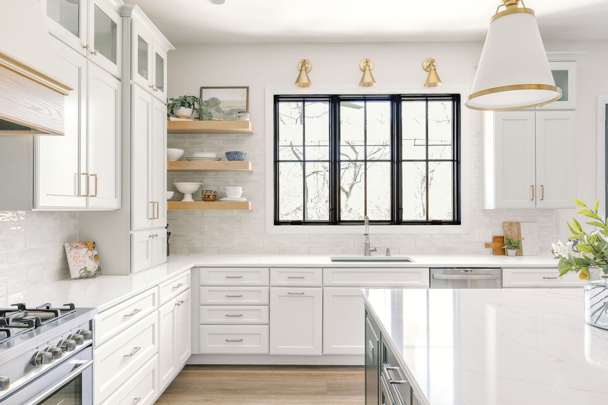
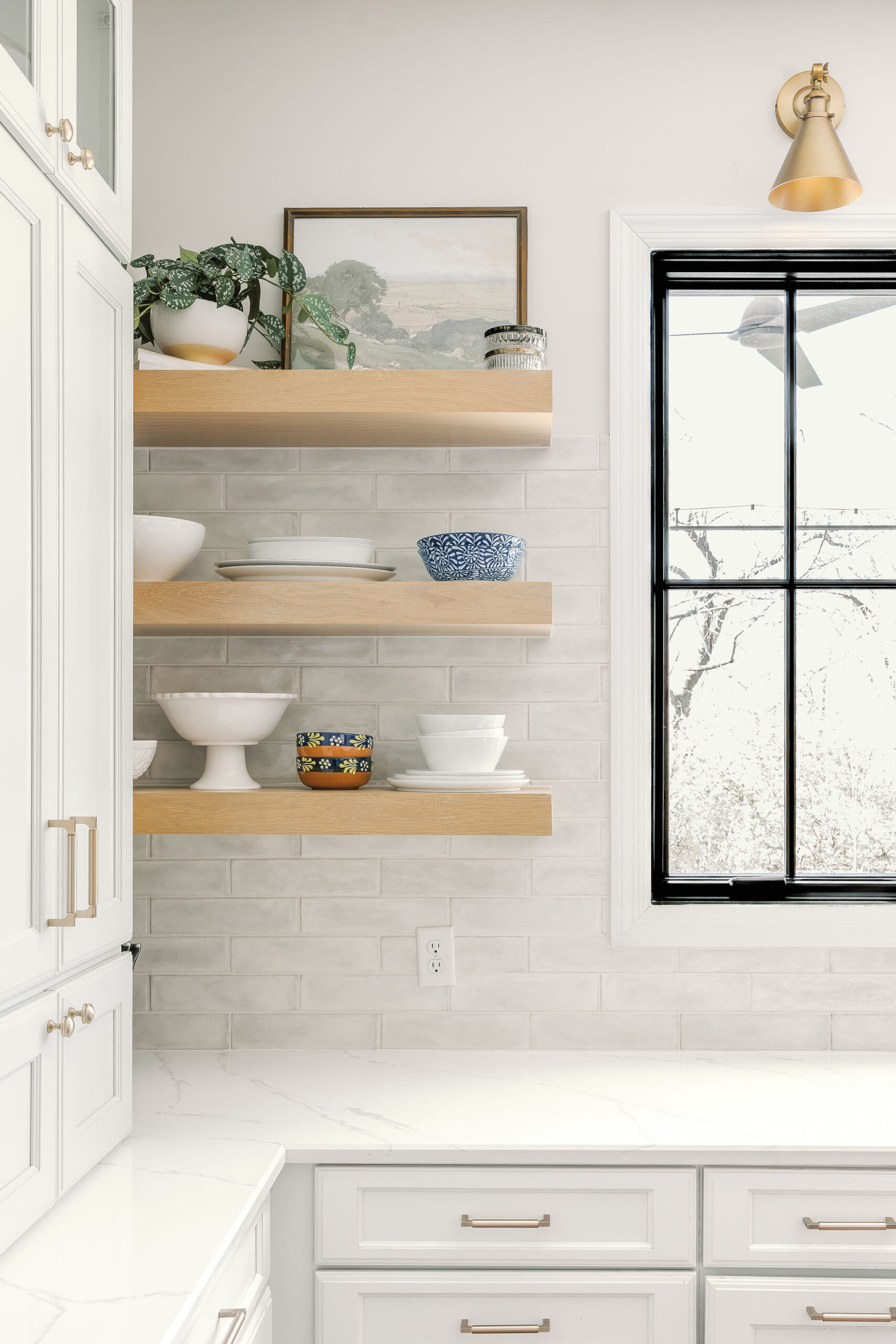 Next, we focused on the materials and accent finishes. To maintain a fresh clean feel, Amy and Jeff selected an elongated hand cut tile that had a variation of hues in creams, whites and subtle greys. It has a polished finished and truly is stunting. We also incorporated white oak accents in the open shelving and custom hood. This added the perfect amount of warmth while keeping the space feeling soft and airy.
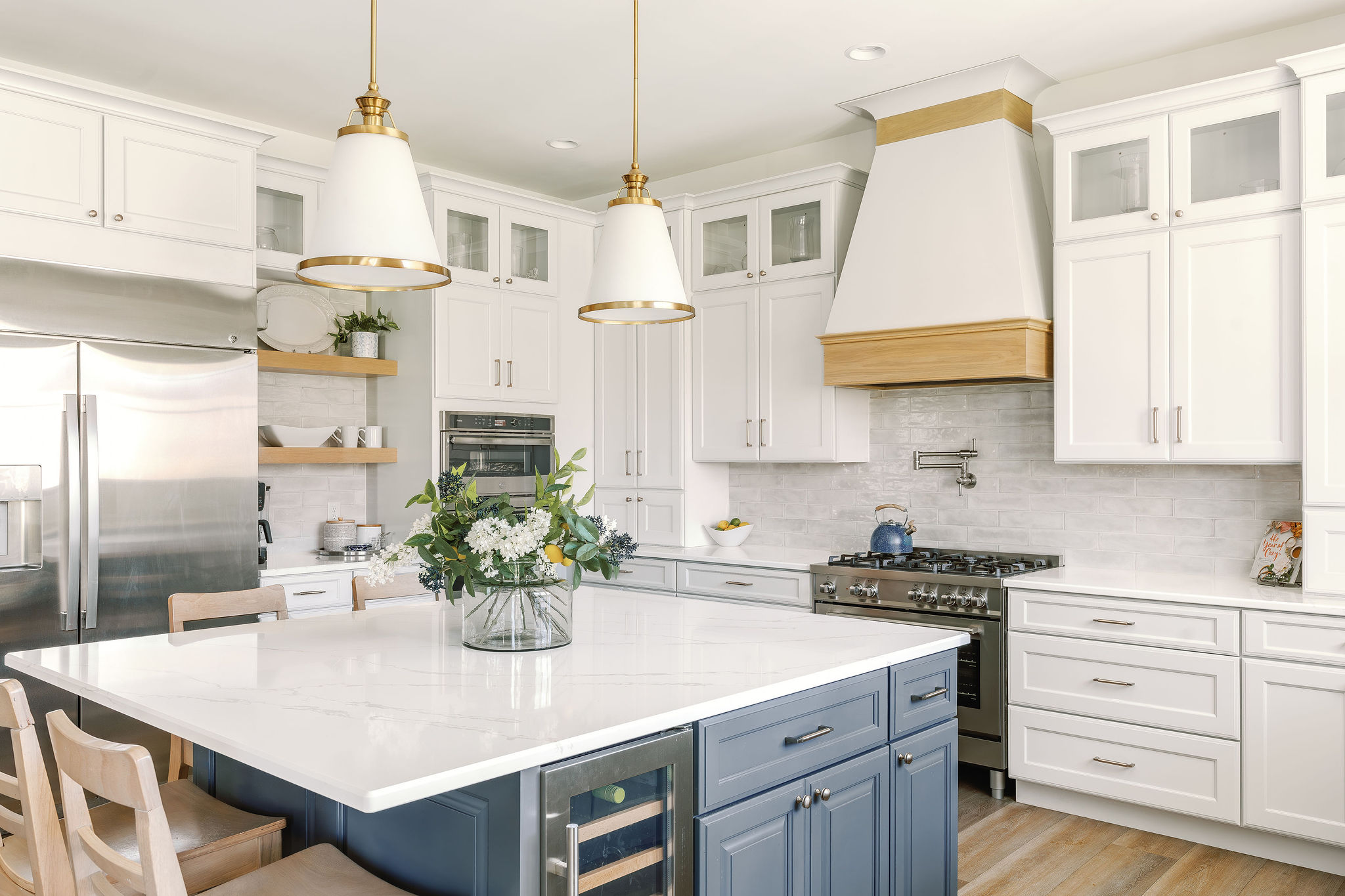 Lastly, we selected two large pendant light fixtures that are frosted glass with brass accents. This lends to the softness of the space, but provides it with the grandeur it deserves. Three brass articulating sconces are positioned above the window along the sink wall and add the perfect amount of warmth against the black windows and wall tile. They accessorized the kitchen with personal mementos and artwork from family and friends, along with white serving dishes that Amy uses regularly.
In conclusion, the space truly acts as the heart of the home and creates a warm and inviting atmosphere. Amy and Jeff are extremely thankful for all the upgrades they have made, especially considering they now have five children! When they initially built their home, they only had three children, but shortly after construction, Amy discovered she was expecting twins! Every inch of this kitchen has been utilized to its fullest potential and has witnessed countless joyous occasions - with many more to come in the future, I'm sure.
Builder: Executive Builders
Designer: Andrea Mitchell
Photographer: Halle Jenkins Creatives
RESOURCES COMING SOON!
 In addition to getting rid of the corner pantry, we added square footage to the builders existing kitchen layout, making it 4' deeper and 2' wider. This allowed us the room we needed to create a beautiful focal point along the back wall with a 36" range, custom hood, and ample storage and counter space. The expansion also allowed for space to incorporate a 48" wide fridge and built-in coffee nook. It also also provided the space we need to center a large set of wood casement windows along the sink wall which floods the space with natural light and clear sightlines to the back yard. With young kids running around, this was important!
 Some of the additional key details in terms of function included:
- A large custom island to house a wine fridge and a cabinet for their Kitchen Aid Mixer.
- Two trash/recycling locations - one by the kitchen sink and the other is located under the coffee bar station on the opposite wall. This may not seem like a big deal, but when making coffee or having a large group in the kitchen, this secondary trash/recycle location is huge!
- An additional oven and convention microwave located next to the coffee bar.
- Pot filler
- Deep Drawers for easy access of pots and pans.
- Double stacked wall cabinets. Not only is this beautiful but it allows for the storage of pretty items that you don't need to access regularly but may want to display.
- Lastly, Storage, storage and more storage.. Amy wanted a home for everything to eliminate any clutter on the counters.
 The little details that make all the difference:
Designing Amy's Kitchen wasn't just about creating a functional and attractive space. It was about infusing every detail with love and personal touches. Amy wanted a kitchen that would not only meet their family needs but also reflect their personality and style.
One of the first things they considered was the color palette. Amy wanted the kitchen to have a fresh feel but not cold. The perimeter cabinets are actually a soft greyish white. Sometimes they look white and other times they look more warm and grey, depending on the time of day. They opted for a deep charcoal blue on the island and selected a white quartz with beautiful large grey veining running through it. Amy was a bit nervous that the veining might be too much, but I assured her it would add some much needed interest and tie everything together beautifully, which it did and they now love!
 Next, we focused on the materials and accent finishes. To maintain a fresh clean feel, Amy and Jeff selected an elongated hand cut tile that had a variation of hues in creams, whites and subtle greys. It has a polished finished and truly is stunting. We also incorporated white oak accents in the open shelving and custom hood. This added the perfect amount of warmth while keeping the space feeling soft and airy.
 Lastly, we selected two large pendant light fixtures that are frosted glass with brass accents. This lends to the softness of the space, but provides it with the grandeur it deserves. Three brass articulating sconces are positioned above the window along the sink wall and add the perfect amount of warmth against the black windows and wall tile. They accessorized the kitchen with personal mementos and artwork from family and friends, along with white serving dishes that Amy uses regularly.
In conclusion, the space truly acts as the heart of the home and creates a warm and inviting atmosphere. Amy and Jeff are extremely thankful for all the upgrades they have made, especially considering they now have five children! When they initially built their home, they only had three children, but shortly after construction, Amy discovered she was expecting twins! Every inch of this kitchen has been utilized to its fullest potential and has witnessed countless joyous occasions - with many more to come in the future, I'm sure.
Builder: Executive Builders
Designer: Andrea Mitchell
Photographer: Halle Jenkins Creatives
RESOURCES COMING SOON!