Discover how we designed Amy's bathroom to have both a fresh and classic feel. Soft whites and creams set the tone for a serene space, while woven lighting accents and window shades add a touch of texture. Polished chrome fixtures provide a clean and timeless look, while Pottery Barn's classic wall sconces add a touch of elegance. Earthy wood accents and a large soaker tub create a sense of warmth and luxury. Creating symmetry and focal points helps to tie the space together. Read on to discover how to combine these elements to design your fresh classic oasis.
A well-designed bathroom not only adds value to your home but also provides a sanctuary for relaxation and rejuvenation. When you step into a beautifully designed bathroom, you can instantly feel the difference it makes in your overall well-being. A thoughtfully designed space can elevate your everyday routine, transforming it into a ritual of self-care. By paying attention to every detail, from the materials used to the placement of fixtures, you can create a space that exudes elegance and functionality.
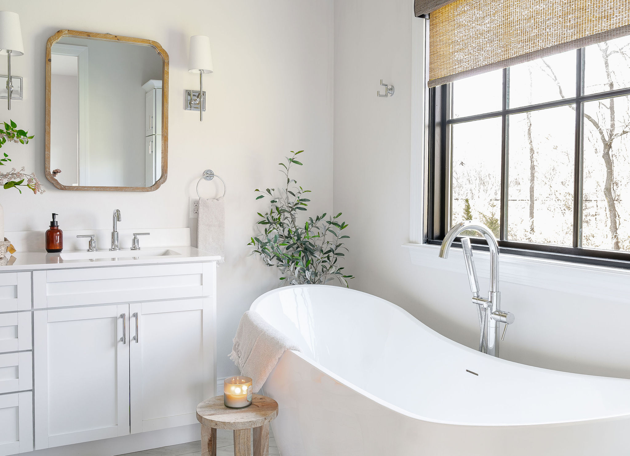
For Amy and Jeff's Master Bathroom, we had an overall footprint we had to stay within, so we needed to make smart choices when it came to selecting fixtures and cabinetry to maximize the space and desired feel. Amy and Jeff opted for a large walk-in shower and freestanding soaker tub centered below the back window. They went with a classic white shaker-style double vanity and we utilized vertical space by adding a tall cabinet to store towels, toiletries, and other bathroom essentials, and wall hooks for bath towels and robes.
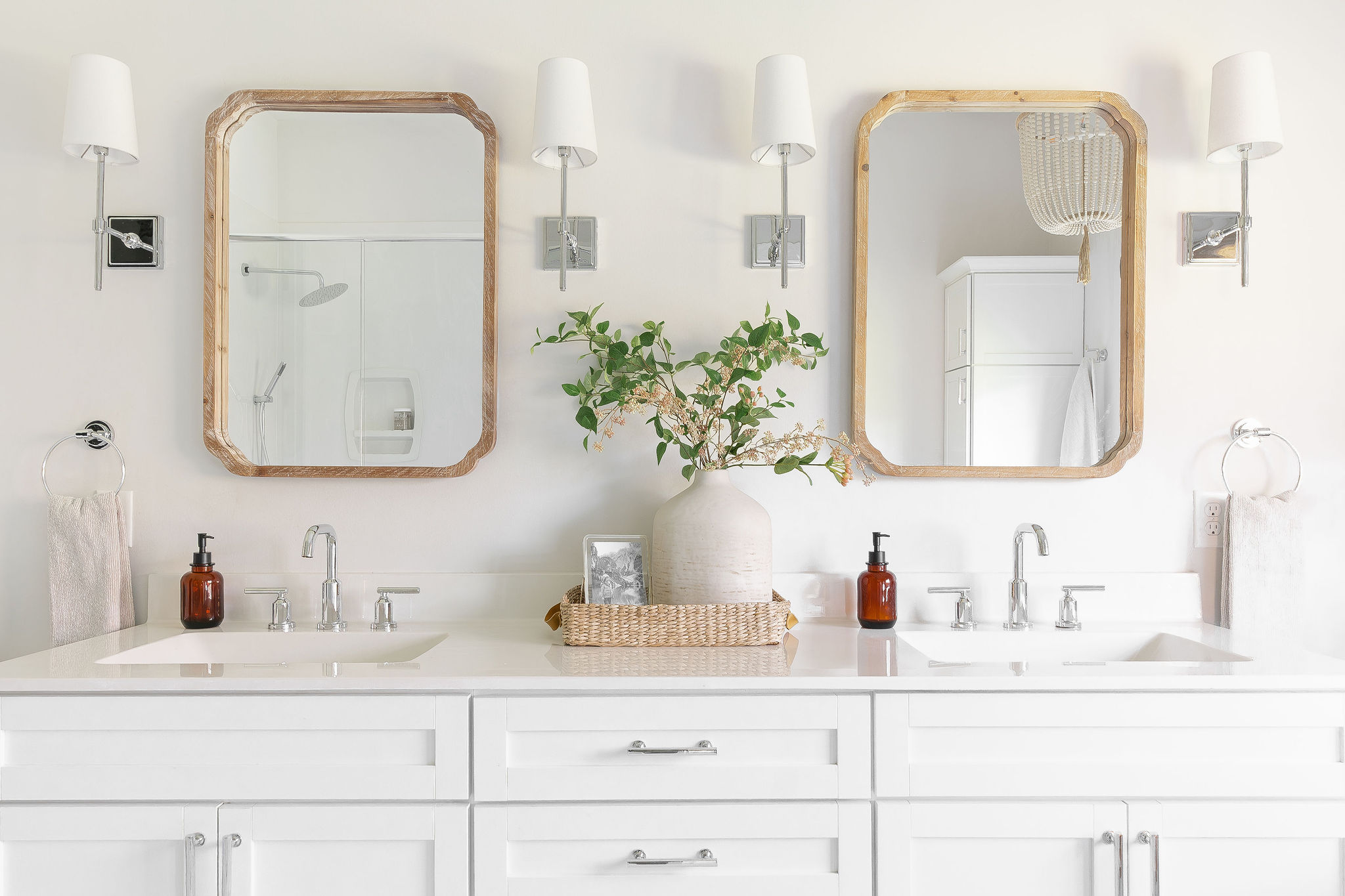
Amy and Jeff wanted a fresh classic feel, but with timeless-looking elements that were durable and easy to maintain. To accomplish this we selected a vinyl plank tile in a marble finish, white cabinetry, and high-end polished chrome faucets and lighting fixtures. To balance all of the cool elements we selected wood vanity mirrors with a white-washed finish, wall sconces with a soft linen shade, and incorporated light wood and woven accents for the chandelier and window treatment. These materials not only add a touch of luxury but also have a timeless appeal.
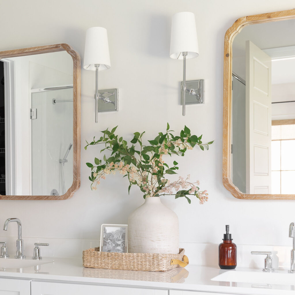 Another important aspect of their space was the addition of statement pieces such as the freestanding bathtub and chandelier above. These elements not only enhance the overall design but also serve as focal points in the room. To add warmth and convenience, they included remote-controlled woven shades that can be easily adjusted. The beautiful wall sconces from Pottery Barn added another focal point along the main wall with their sleek polished chrome finish and timeless design, perfectly complementing the wood mirrors and creating a striking contrast.
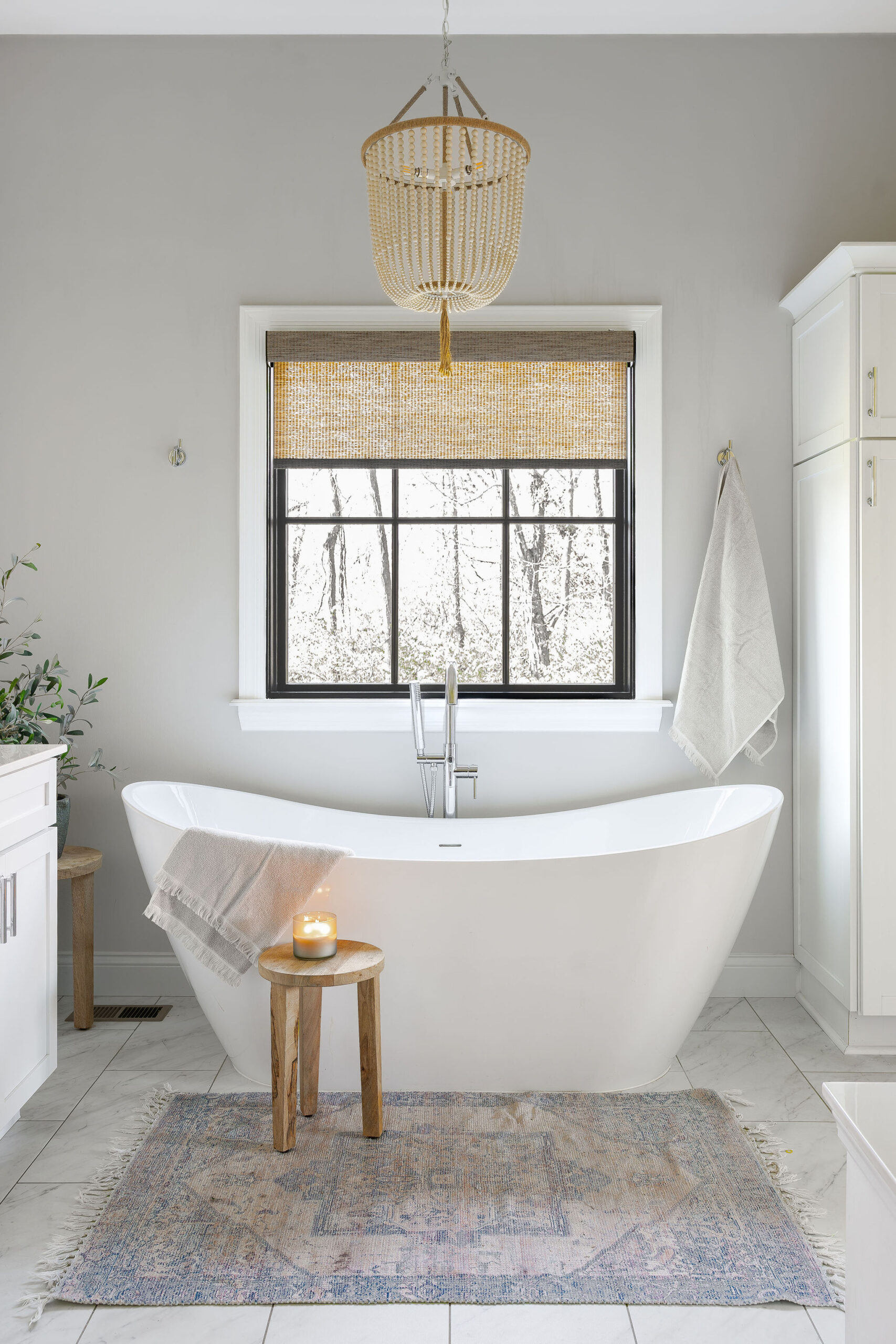 Amy was concerned they would lack storage space without a linen closet in their bathroom, so we incorporated a tall narrow cabinet in the same finish and style as the vanity. There was just enough space to the right of the tub. We were a bit concerned it would feel out of place, but it fits seamlessly into the space and provides Amy and Jeff with the additional storage they need. To balance the tall cabinet we positioned a wooden stand and tall plant on the opposite side. The bathroom is styled minimally in soft earthy hues and an oriental rug adds the perfect amount of interest and color to the space.
In conclusion, the space has a light airy feel that makes their bathroom feel spacious and tranquil.
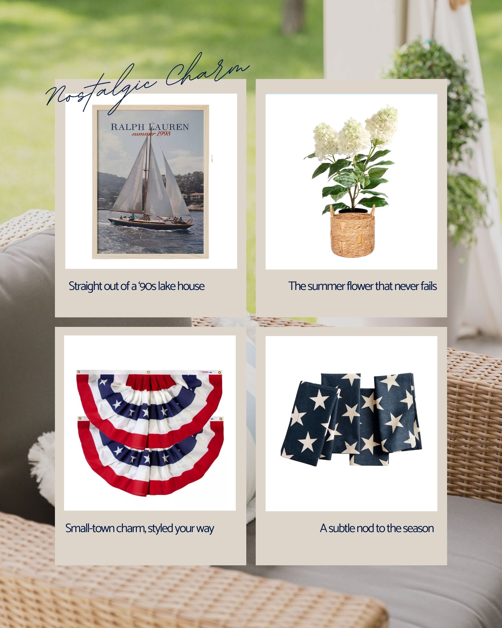
To Shop this space, simply click on the items in the image below!
Please note, some of the links in this page are affiliate links. This means that if you click on the link and make a purchase, I will receive a commission without any additional cost to you.
Builder: Executive Homes
Interior Design: Andrea Mitchell
Photography: Halle Jenkins Creatives
 Another important aspect of their space was the addition of statement pieces such as the freestanding bathtub and chandelier above. These elements not only enhance the overall design but also serve as focal points in the room. To add warmth and convenience, they included remote-controlled woven shades that can be easily adjusted. The beautiful wall sconces from Pottery Barn added another focal point along the main wall with their sleek polished chrome finish and timeless design, perfectly complementing the wood mirrors and creating a striking contrast.
 Amy was concerned they would lack storage space without a linen closet in their bathroom, so we incorporated a tall narrow cabinet in the same finish and style as the vanity. There was just enough space to the right of the tub. We were a bit concerned it would feel out of place, but it fits seamlessly into the space and provides Amy and Jeff with the additional storage they need. To balance the tall cabinet we positioned a wooden stand and tall plant on the opposite side. The bathroom is styled minimally in soft earthy hues and an oriental rug adds the perfect amount of interest and color to the space.
In conclusion, the space has a light airy feel that makes their bathroom feel spacious and tranquil.
To Shop this space, simply click on the items in the image below!
Please note, some of the links in this page are affiliate links. This means that if you click on the link and make a purchase, I will receive a commission without any additional cost to you.
Builder: Executive Homes
Interior Design: Andrea Mitchell
Photography: Halle Jenkins Creatives