Design cover pic

DESIGN

recent projects

Bathroom 3

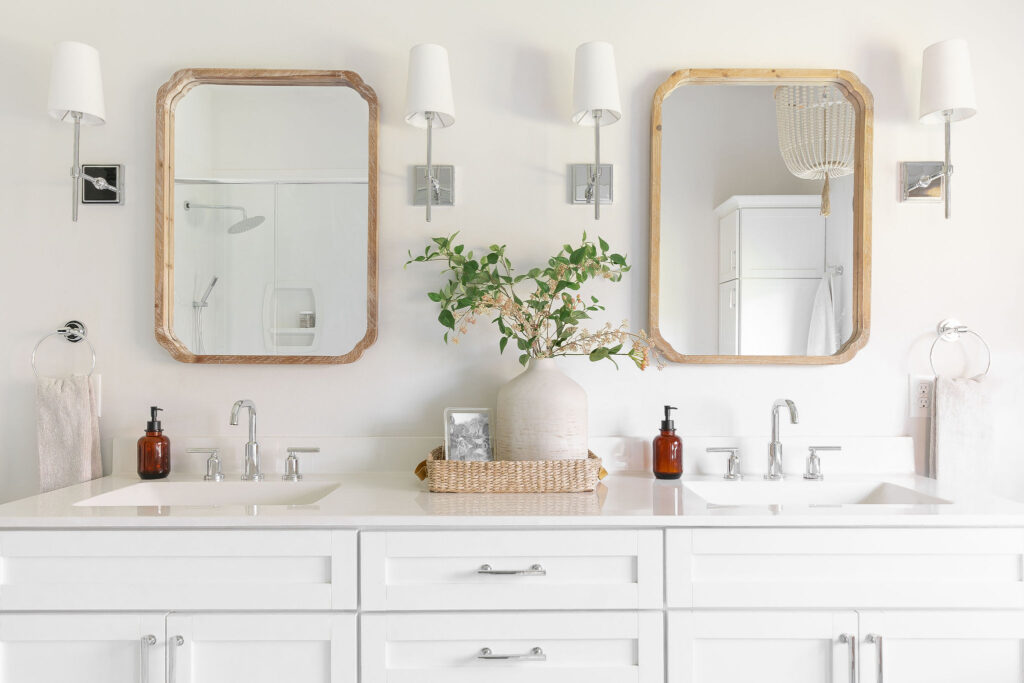
Bathroom Bliss: Designing a Fresh Classic Oasis

Discover how we designed Amy’s bathroom to have both a fresh and classic feel. Soft whites and creams set the tone for a serene space, while woven lighting accents and window shades add a touch of texture. Polished chrome fixtures provide a clean and timeless look, while Pottery Barn’s classic wall sconces add a touch of elegance. Earthy wood accents and a large soaker tub create a sense of warmth and luxury. Creating symmetry and focal points helps to tie the space together. Read on to discover how to combine these elements to design your fresh classic oasis. A well-designed bathroom not only adds value to your home but also provides a sanctuary for relaxation and rejuvenation. When you step into a beautifully designed bathroom, you can instantly feel the

Read More »
Office refresh

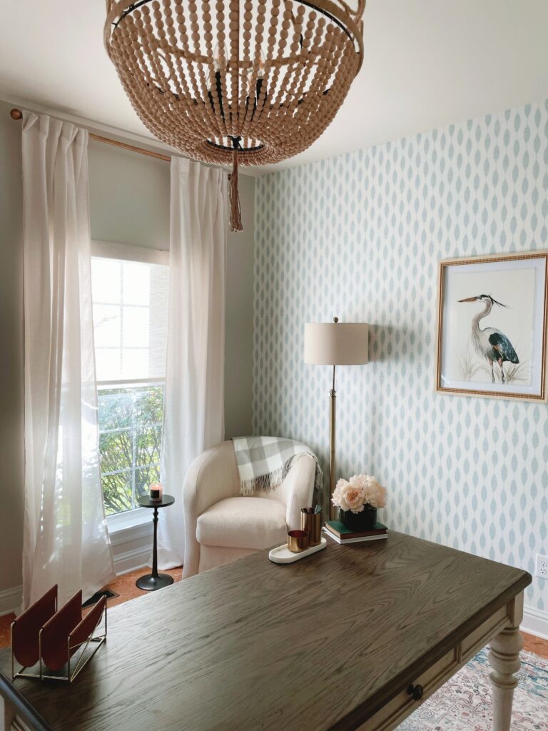
Home Office Refresh with a Classic Breezy Touch

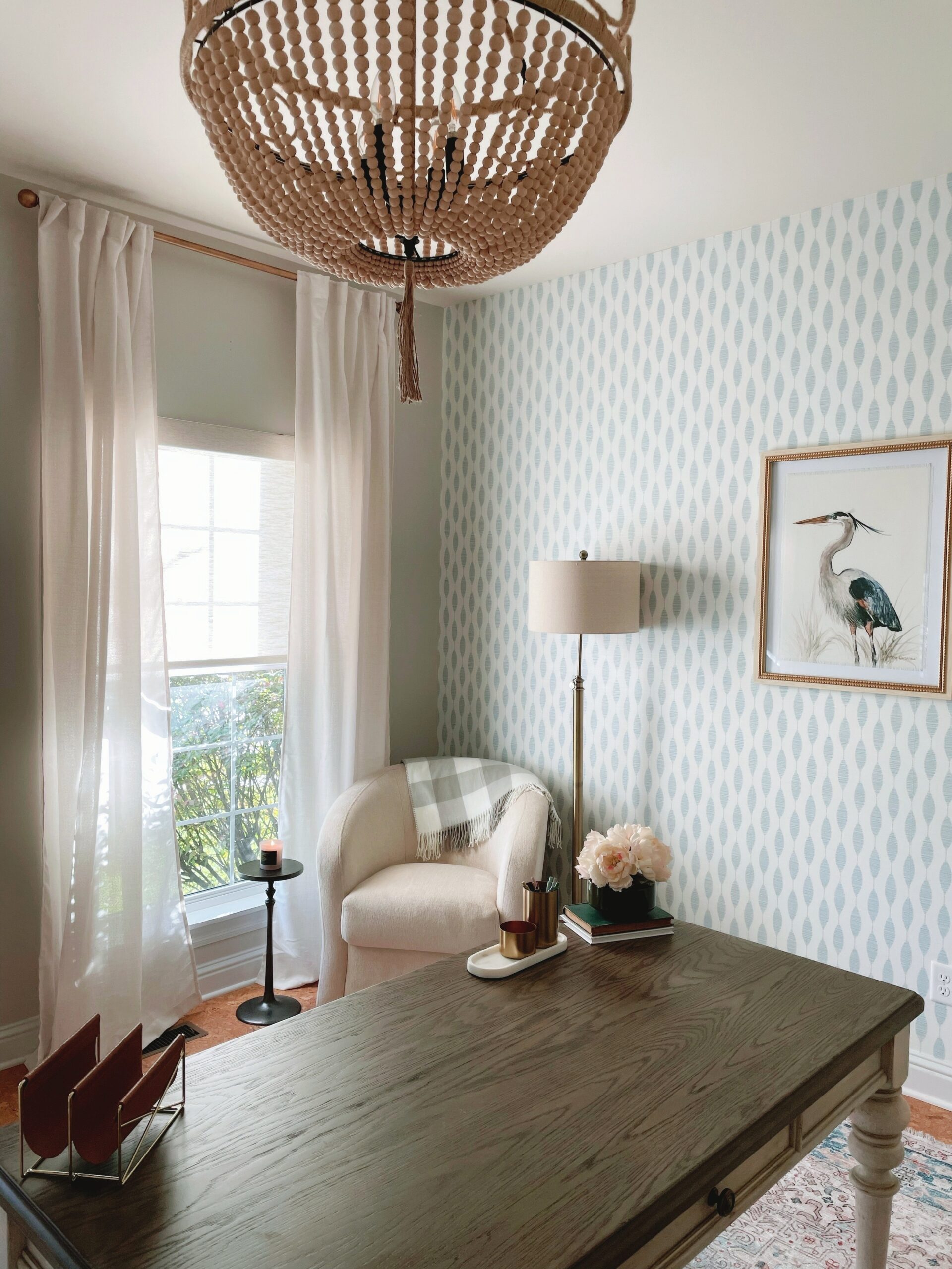
Hey there, I am excited to share a recent office redesign I did for one of my sisters. The existing office space was in definite need of a makeover. Dark and tired, the layout hindered productivity and made working a monotonous task. With little legroom and limited options for add-ons like a sit-stand desk, it was clear that a redesign was necessary. By reconfiguring the existing cabinets, creating an open layout, and introducing a free-standing sit-stand desk, the space was transformed into a functional and sophisticated workspace. With the goal of achieving a Serena Lily-meets-Midwest vibe on a budget, upgrades were made to the lighting fixtures, window treatment, and cabinet hardware. The addition of linen drapes and playful wallpaper completed the breezy and inviting atmosphere. Get inspired as we walk

Read More »
Kitchen photo 1

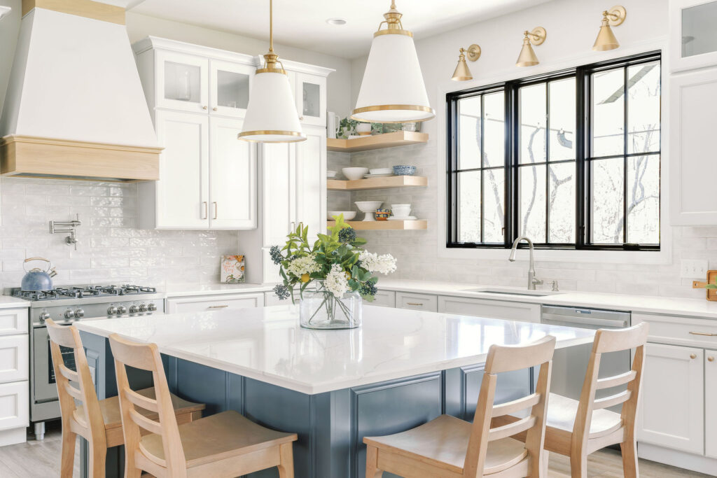
Nailing the Perfect Design: Amy’s Kitchen, Conception to Completion

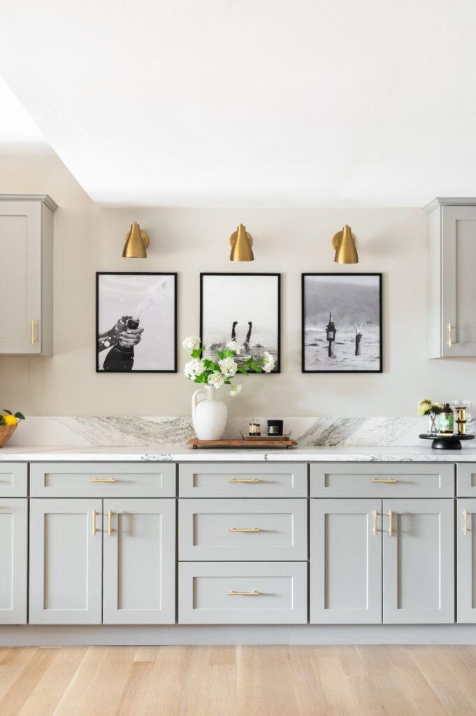
From brainstorming to drawings, how Amy’s kitchen took shape. Back in the summer of 2019 I began working with Amy and her husband Jeff to design their new Kitchen for their forever home that was being built.  The builder already had a Kitchen layout for the home, but let’s be honest.. they were seeking a “forever” kitchen with a wow factor. A space that could evolve as they evolved. One that had a timeless design, ample storage, and was high in function and feel. They wanted the design to maximize workspace and storage options, while still maintaining a sense of openness and light. The initial concept came together rather quickly, and as I provided detailed drawings and elevations, Amy and Jeff had a clear vision of how the kitchen would

Read More »

welcome

Amy and Andrea Sidebar pic

Every Season Living embraces and celebrates all seasons of life. Everything from the fun boisterous holidays to the sometimes messy in-between moments of life, we are sharing ours with you!

categories

popular posts

Search