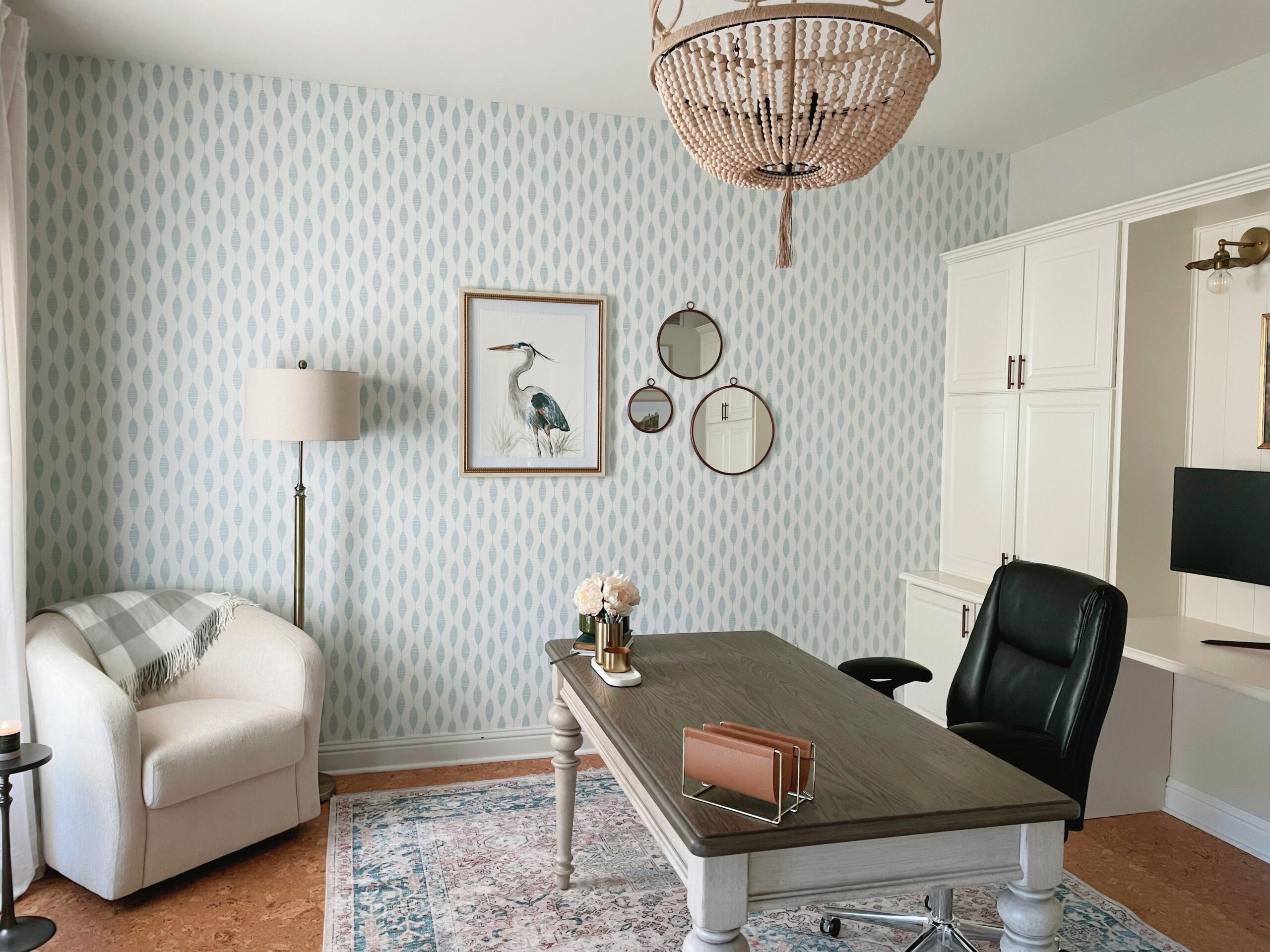
Hey there, I am excited to share a recent office redesign I did for one of my sisters. The existing office space was in definite need of a makeover. Dark and tired, the layout hindered productivity and made working a monotonous task. With little legroom and limited options for add-ons like a sit-stand desk, it was clear that a redesign was necessary. By reconfiguring the existing cabinets, creating an open layout, and introducing a free-standing sit-stand desk, the space was transformed into a functional and sophisticated workspace. With the goal of achieving a Serena Lily-meets-Midwest vibe on a budget, upgrades were made to the lighting fixtures, window treatment, and cabinet hardware. The addition of linen drapes and playful wallpaper completed the breezy and inviting atmosphere. Get inspired as we walk you through the office redesign process! All of the resources are included below!!
Let's talk about what makes an office redesign unique and why it's worth considering. An office redesign is not just about making a space more aesthetically pleasing; it's also about creating an environment that fosters productivity and creativity. When you spend a significant portion of your day in an office, it's essential to have a space that inspires and energizes you. A well-designed office can have a significant impact on your mood and overall well-being. Soft blues and breezy vibes, like in this office redesign, can create a calming effect, promoting a relaxed and focused mindset.
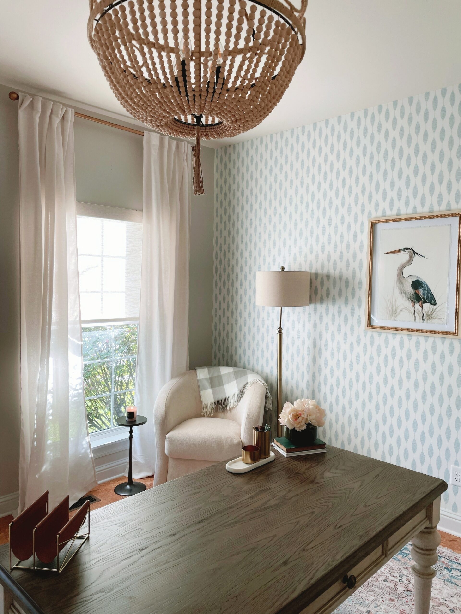 Before diving into the details of this office redesign, let's take a closer look at what wasn't quite working in the previous space. The old office felt dark and failed to create a positive, energetic ambiance. The furniture layout felt cramped. making it difficult to incorporate a sit-stand option that was desperately desired.
However, there were some aspects that did work well. The office had windows that allowed natural light to filter in, creating a pleasant and refreshing atmosphere during the day. The layout of the room was a good size, with enough space to consider different layout options. The existing cabinets were in good condition and all on a 19” module, making reconfiguring ideal.
Our solution was reconfiguring the existing layout to create a more spacious and open environment with two distinct workspaces. To achieve this, we utilized all the existing cabinetry (but one) and added a few additional doors and misc. parts to create a beautiful credenza/ desk unit that grounded the space and provided a beautiful and functional backdrop. We had a custom work surface made in a matching finish to complement the new design and elevate the look. Furthermore, crown molding was applied to the existing cabinets, and paneling was added to the open space on the credenza unit, accomplishing a seamless built-in appearance. The result is a more fluid and open floor plan that allows for better sight lines, and the addition of a free-standing sit-stand desk.
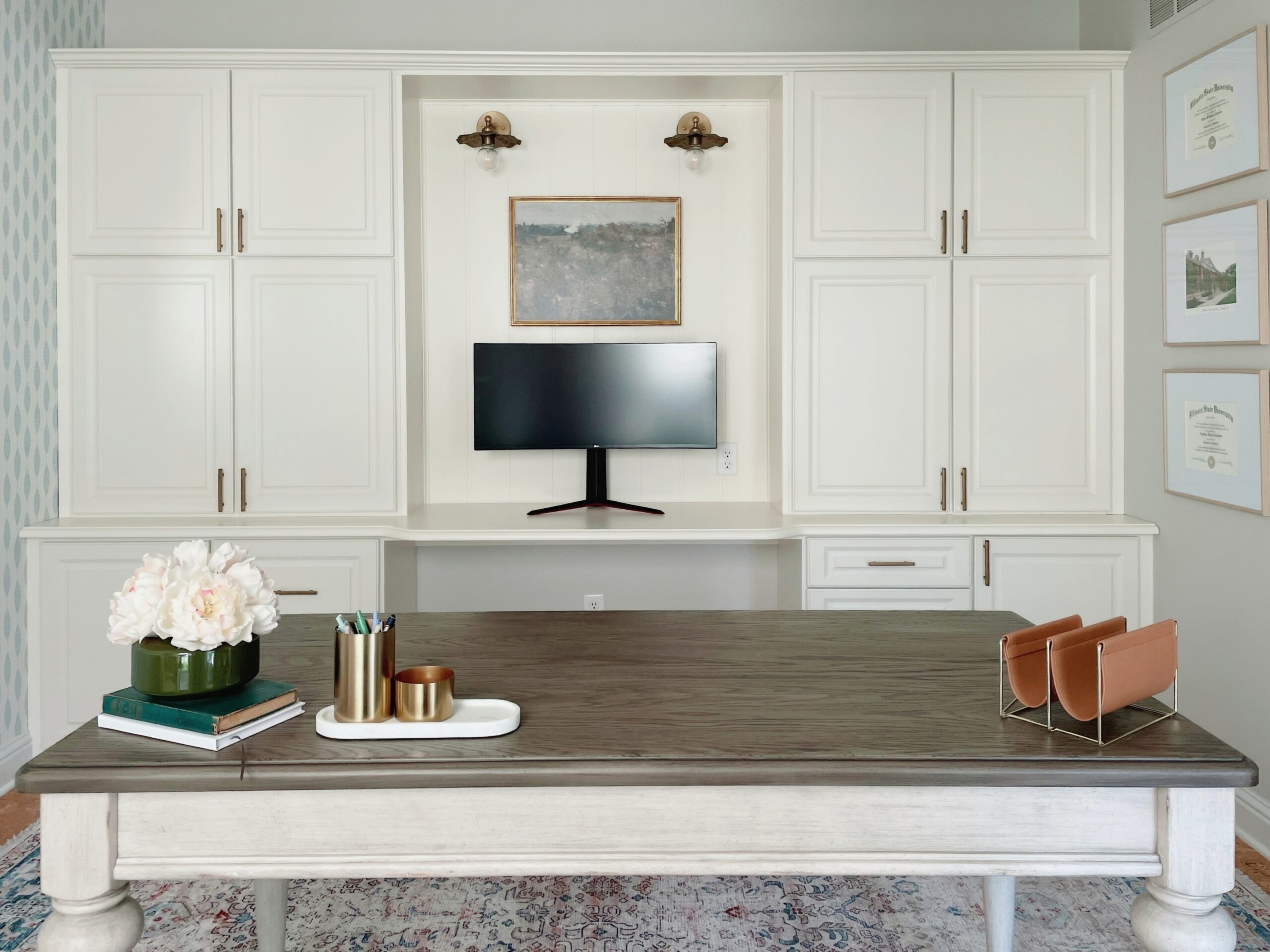 Let's talk about inspiration. My sister wanted a space that exuded breezy classic vibes with a touch of glam. It's the first room you see when you walk into the home, so it was important to create a timeless design that provided that breezy vibe, but also flowed with the rest of the home.
We started by finding wallpaper that had those breezy vibes but wasn’t overly coastal in feel. To transform the overall feel of the space, we opted to place the wallpaper on a wall that was highly visible to the entire space to add interest and depth. The other walls were painted in a lighter shade that complimented the new wallpaper, creating a soothing backdrop for the entire office. Another big change was in the lighting. There was a decent amount of electrical reconfiguring that needed to be done to support the new layout, which also included having sconces wired into the back wall credenza unit and changing out the existing ceiling fan to a chandelier.
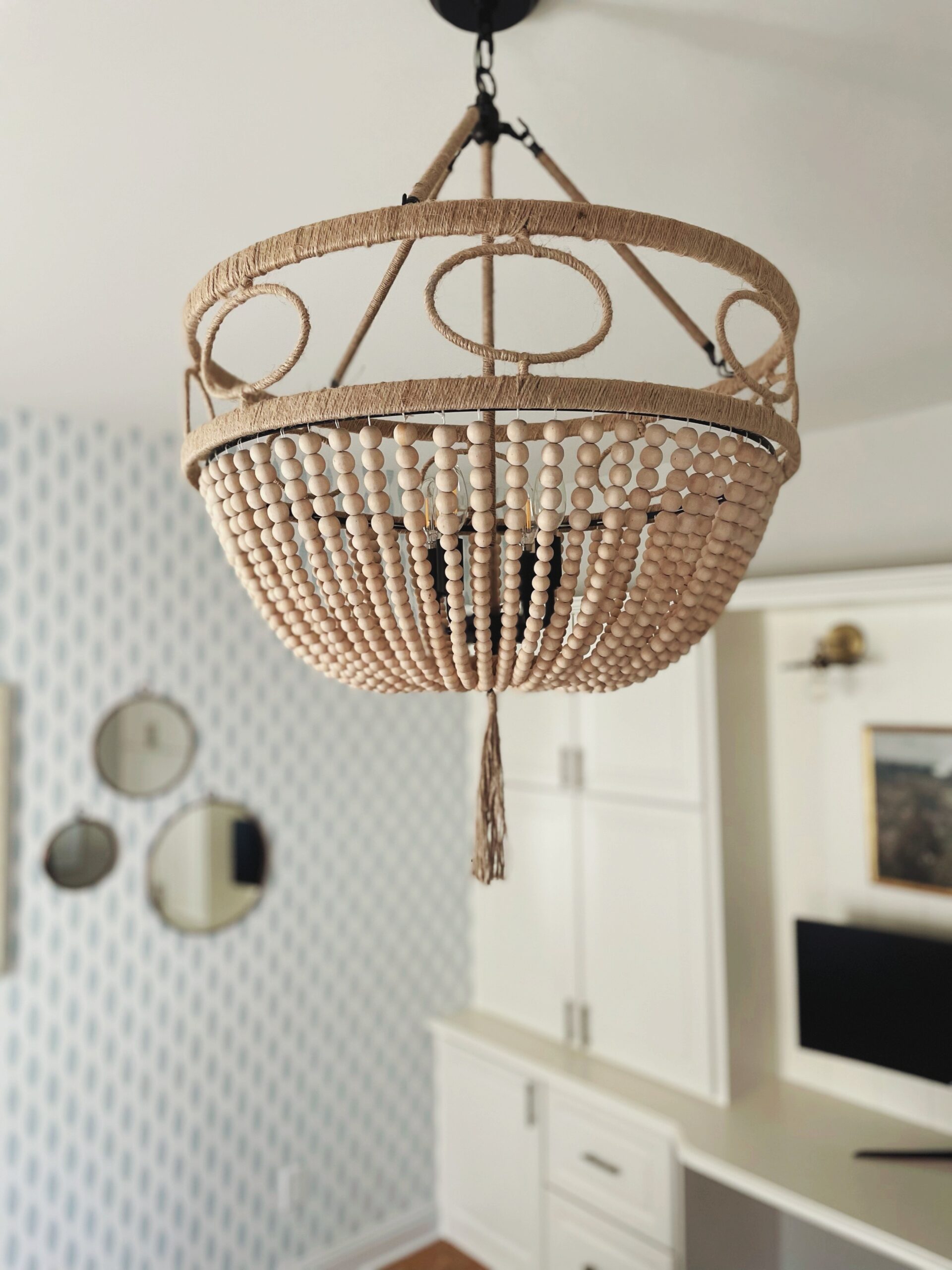 We carefully selected design elements that would complement the soft blues and creams in the office, while staying true to a mid-west feel vs. coastal. One of the key components we incorporated woven accents. From soft shades to natural textures and wood accents in the chandelier. They brought an organic feel that perfectly balanced the cool tones and subtle touches of glam.
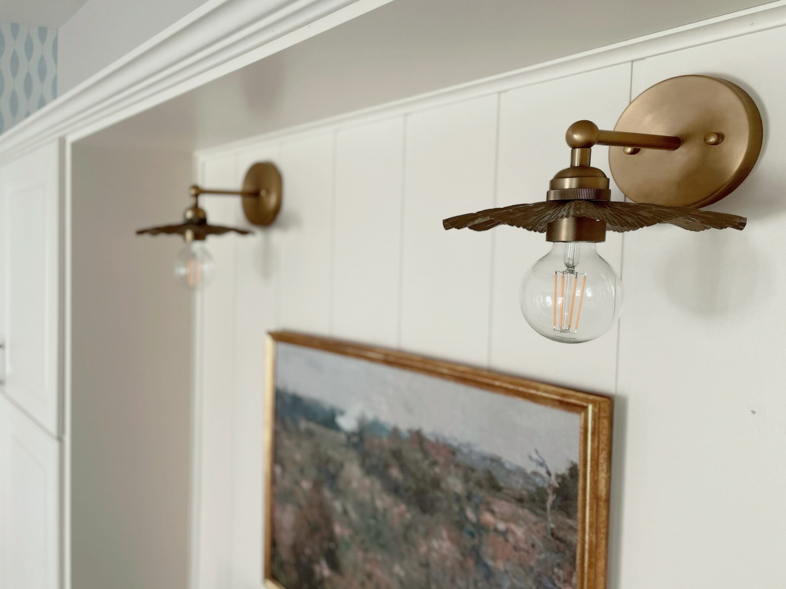
To add warmth and a touch of elegance, we included warm brass accents throughout the office. From new brass sconces to cabinet pulls that I absolutely love, these metallic accents added a subtle shine and slightly feminine touch.
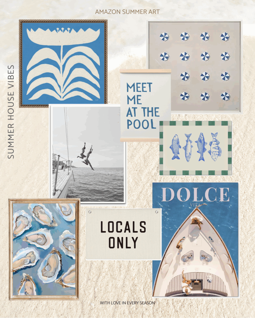
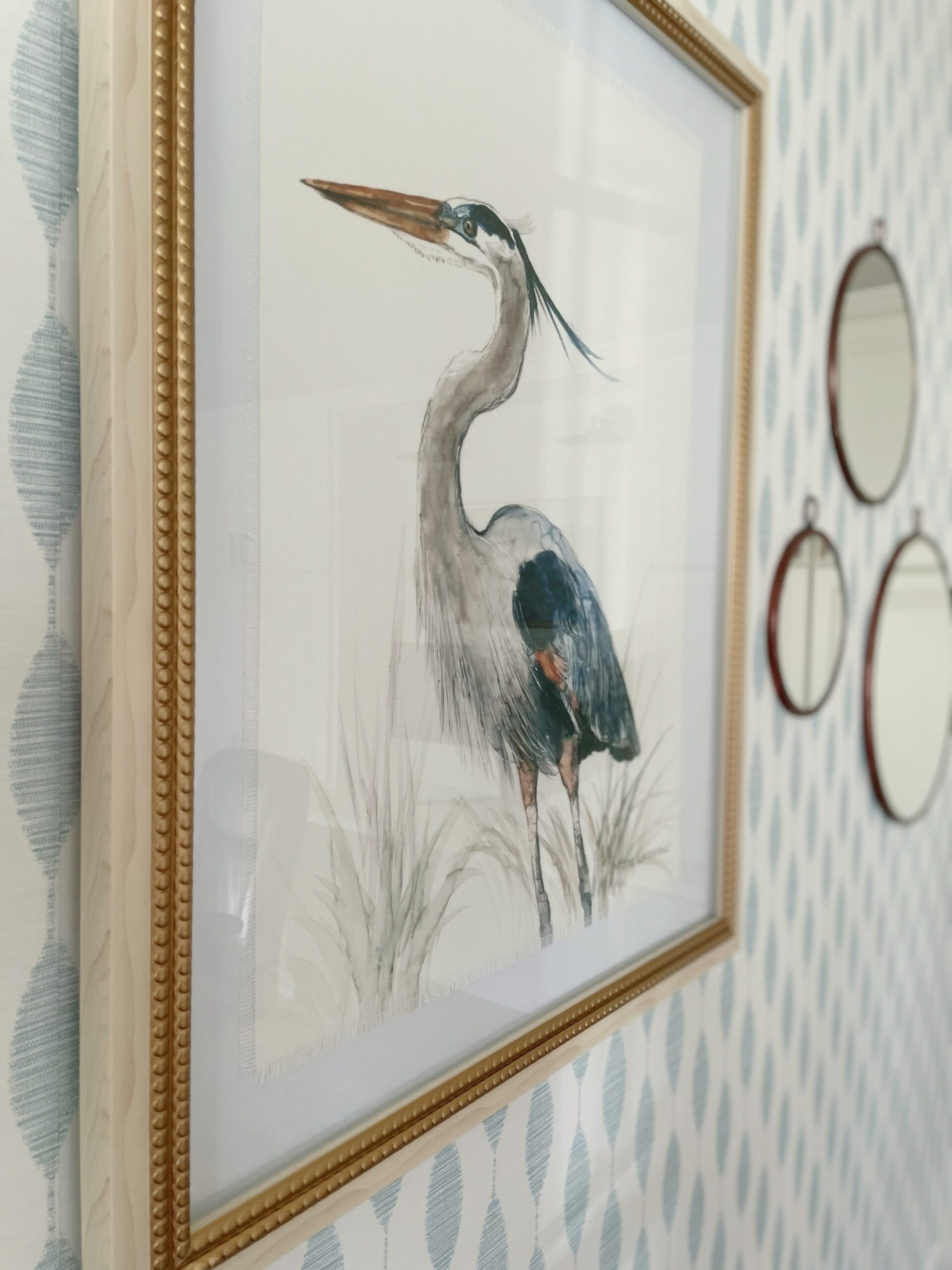
 The artwork was also carefully selected to create a sophisticated feel that complimented the new breezy feel while adding interest to the space. The large painting of the Great Blue Heron came from Home Goods. It contains the certificate of authenticity and offers so much interest to the space. From the fridge linen canvas, it’s painted onto the colors and details on the frame. It truly was the perfect piece for this space. We incorporated furniture and linen drapes in shades of white and cream, adding to the overall airy and relaxed vibe.
 The result is a home office that oozes relaxation and creativity with soft blues, creams, woven accents, and warm brass touches while providing a functional working environment.

 Before diving into the details of this office redesign, let's take a closer look at what wasn't quite working in the previous space. The old office felt dark and failed to create a positive, energetic ambiance. The furniture layout felt cramped. making it difficult to incorporate a sit-stand option that was desperately desired.
However, there were some aspects that did work well. The office had windows that allowed natural light to filter in, creating a pleasant and refreshing atmosphere during the day. The layout of the room was a good size, with enough space to consider different layout options. The existing cabinets were in good condition and all on a 19” module, making reconfiguring ideal.
Our solution was reconfiguring the existing layout to create a more spacious and open environment with two distinct workspaces. To achieve this, we utilized all the existing cabinetry (but one) and added a few additional doors and misc. parts to create a beautiful credenza/ desk unit that grounded the space and provided a beautiful and functional backdrop. We had a custom work surface made in a matching finish to complement the new design and elevate the look. Furthermore, crown molding was applied to the existing cabinets, and paneling was added to the open space on the credenza unit, accomplishing a seamless built-in appearance. The result is a more fluid and open floor plan that allows for better sight lines, and the addition of a free-standing sit-stand desk.
 Let's talk about inspiration. My sister wanted a space that exuded breezy classic vibes with a touch of glam. It's the first room you see when you walk into the home, so it was important to create a timeless design that provided that breezy vibe, but also flowed with the rest of the home.
We started by finding wallpaper that had those breezy vibes but wasn’t overly coastal in feel. To transform the overall feel of the space, we opted to place the wallpaper on a wall that was highly visible to the entire space to add interest and depth. The other walls were painted in a lighter shade that complimented the new wallpaper, creating a soothing backdrop for the entire office. Another big change was in the lighting. There was a decent amount of electrical reconfiguring that needed to be done to support the new layout, which also included having sconces wired into the back wall credenza unit and changing out the existing ceiling fan to a chandelier.
 We carefully selected design elements that would complement the soft blues and creams in the office, while staying true to a mid-west feel vs. coastal. One of the key components we incorporated woven accents. From soft shades to natural textures and wood accents in the chandelier. They brought an organic feel that perfectly balanced the cool tones and subtle touches of glam.
To add warmth and a touch of elegance, we included warm brass accents throughout the office. From new brass sconces to cabinet pulls that I absolutely love, these metallic accents added a subtle shine and slightly feminine touch.
 The artwork was also carefully selected to create a sophisticated feel that complimented the new breezy feel while adding interest to the space. The large painting of the Great Blue Heron came from Home Goods. It contains the certificate of authenticity and offers so much interest to the space. From the fridge linen canvas, it’s painted onto the colors and details on the frame. It truly was the perfect piece for this space. We incorporated furniture and linen drapes in shades of white and cream, adding to the overall airy and relaxed vibe.
 The result is a home office that oozes relaxation and creativity with soft blues, creams, woven accents, and warm brass touches while providing a functional working environment.
